Cool graphic T shirts grab attention and provide one of the most affordable and effective ways to market a business or team, but custom T-shirt graphic art can be tricky. Our talented artists are here to help!
If your t-shirt’s graphic design is too busy or overly complex, it can be unreadable from more than a few feet away. If you choose the wrong color T-shirt for your graphic design, the T shirt color may either muddle or overwhelm the art. So, if you are not a trained artist, how do you know whether your T shirt graphic art will be as cool as you hoped?
Have no fear, Broken Arrow artists are here! Our team of artists are trained in graphic art T-shirt design. Our artists know which T-shirt graphic designs look good, read well, and print beautifully. Plus, our screen printing machines are state of the art, and our quality control team is meticulous about each and every print.
Best T-Shirt Art
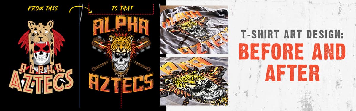
Take a look at the Before and After custom T-Shirt art above. The T-shirt art design on the left is what the customer submitted and the T-shirt art design on the right is what one of our staff artists suggested instead. Of course, the final decision on what to print is ALWAYS the customer’s choice, but in this instance, the customer was thrilled with the updated graphic art.
The Best Graphic T-shirts take into account the following design elements.
- Sizing. The best T-shirt art designs are readable and attractive, but not so big that they look disproportionate.
- Composition. If you place a T-shirt design’s words or graphics in the wrong location, they can be read in the wrong order. If you have several elements within your design, the overall appearance can look jumbled. Some minor changes in placement can make your design appear as one cohesive whole. Sometimes, this can be as simple as adding a border or creating an outlining shape.
- Edging. Some T-shirt art designs grab attention without order borders, others can look more cohesive with them. A trained artist can help you make the call.
- Typography. The fonts, lines, and punctuation you use on your T-shirt dramatically affect the design’s artfulness and readability. A simple rule to follow: limit fonts to a maximum of three in any T-shirt art design.
- Placement. Asymmetrical T-shirt art should be centered visually, not solely based on width.
- Color. When it comes to T-shirt printing, more colors typically mean higher cost. But, by using half tones, you can create shading (for example, white can appear gray) without requiring another color screen.
- Contrast. Tone-on-tone graphic art designs can look classy but may not be the best choice if your goal is to have your logo recognized from across the street.
- Inversion. When a design is printed in the wrong color a face (for example) can look distorted or skeletal.
- Simplicity. A design that is too busy can overwhelm the eye and viewers may miss the intended message.
- Resolution. If your image is poor quality, your printed design may appear pixilated or blurry.