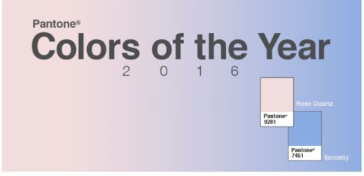
I have been trying to figure out now for years why Pantone chooses the colors that they do for color of the year. This year, they chose to blend two colors to create 1. What the heck?! I only care about the colors that they choose because sometimes, they can be an indicator of which t-shirts or screen printing inks are going to be popular in 2016. This year, yeah not so much. I have included my personal list of why I don’t think these colors are going to be very popular in the custom t-shirt printing market.
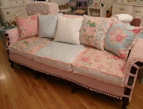
- The colors are just plain ugly. Who likes these colors?! They are not very masculine if that’s your kind of thing, and they are not super feminine either. They just seem like old lady colors to me. I suppose in today era, they might consider a something with those colors together, like a couch, to be called shabby chic. But seriously, who would want to put this in their house? Yes, I agree, perhaps my grandma or a southern bell lady. That narrows the market down for those colors quite a bit.

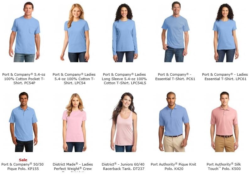
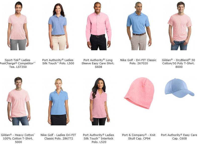
- A sophisticated name doesn’t make it a more sophisticated color. Does anyone else see baby blue and pink here? If I call Baby Pink by Rose Quartz instead…does it transform it into a new color? I’m sure some psychology experts would argue that yes it does, my eye argues that no it doesn’t. I took a quick look and did some filtering to find some of the blanks we offer. I thought it might be fun to compare what these are “normally” called out in the world today. Here are the garment choices available. Every. Single. One. Of these garments below is called light blue or light pink. LOL.


- Light Blue & Light Pink are just not popular for screen printing or custom t-shirt printing. We print thousands of shirts each day, work with all sorts of different companies/teams/clubs, and very rarely sell these garment colors or ink colors. Sometimes customers ask for obscure things like a deep berry hoodie. When I can’t find it ANYWHERE from the over 25,000 garments we offer, I assume no one carries it because well…..no one would buy them. In my search of the list above, I came up with 20 out of over 2,000 garment choices in just that one catalog. I checked with my production manager to see how much baby pink and baby blue we buy – hardly any! Check out our Screen Printing Sample Page and you’re not going to find much of those two colors.
- There are so many more beautiful options! Check out or silk screen ink color options, I’ll bet your favorite isn’t light pink or blue. Personally, I am not a fan of pastel anything. I like rich pinks like helconia or super fuschia and rich blues like royal. Our number one selling shirt is the Gildan 2000, look at those colors and I am certain you fill find something preferable.
Now, if you are a fan of light pink and light blue…oops I mean Rose Quartz and Serenity, then by all means, we’ve got the perfect ink color or garment color for you! But if you are not, don’t worry, we have thousands of garments to choose from and a screen printing ink color that will better suit your needs. Whether you want to customize a single shirt or a bulk batch, the most important thing to us at Broken Arrow is that you love your finished product – color and all!