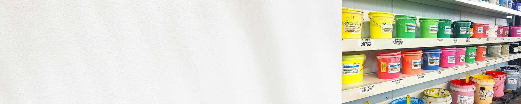
Screen Printing Ink Colors
Check out our screen printing color chart to choose the best color for your project. PMS Colors available for all inks for closest color matching.
- # of Available Standard Plastisol Colors: 51 (10 New Colors Just Added)
- # of Available Fluorescent Colors: 7
- # of Available Glitter & Shimmer Colors: 10
- # of Available Premium Colors: 10
Standard Plastisol Inks
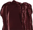
Maroon
(PMS 504C)
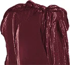
Burgundy
(PMS 7421C)
Russell Cardinal
(PMS 1945C)
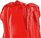
Super Drake Red
(PMS 2035C)
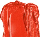
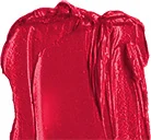
Super
Red
(PMS 2347C)
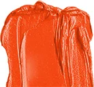
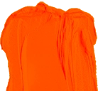
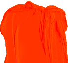
Clockwork Orange
(PMS 2027C)
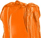
Dolphin Orange
(PMS 165C)
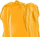
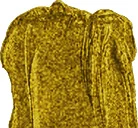
Gold
8000
(PMS 1375C)
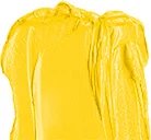
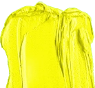
Super Lemon
Yellow
(PMS 108C)
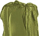
Olive
(PMS 5763C)
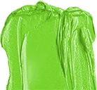
Black Light Green
(PMS 360C)
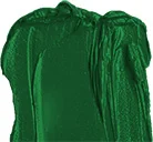
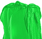
Super Spring Green
(PMS 355C)
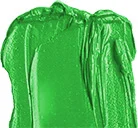
Super Dallas Green
(PMS 356C)
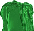
Kelly
Green
(PMS 3425C)
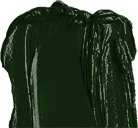
Dark Chrome Green
(PMS 3435C)
Peacock
(PMS 316C)
NEW
Deep
Aqua
(PMS 322C)
Super Turquoise
(PMS 7710C)
Seafoam
(PMS 2239C)
NEW
Light Blue
(PMS 658C)
Baby Blue
(PMS 2905C)
NEW
Denim
(PMS 2160C)
NEW
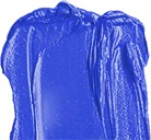
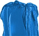
Contact
Blue
(PMS 299C)
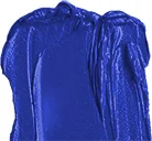
Super Marine Blue
(PMS 2132C)
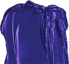
Super
Royal
(PMS 2728C)
Deacon
Blue
(PMS 2746C)
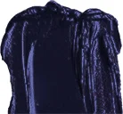
Bears
Navy
(PMS 281C)
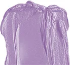
Lavender
(PMS 2567C)
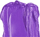
Purple
50200
(PMS 2088C)
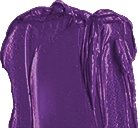
Russell Purple
(PMS 7679C)
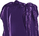
Super
Purple
(PMS 7672C)
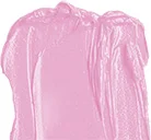
Light Pink
(PMS 217C)
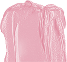
Baby Pink
(PMS 182C)
NEW
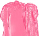
Panther
Pink
(PMS 210C)
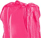
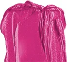
Hot Pink
(PMS 213C)
Brandywine
(PMS 233C)
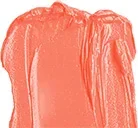
New Coral
(PMS 2029C)
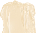
Natural
(Hex:#FFF1D6)
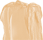
Sand
(PMS 474C)
NEW
Rebel Flesh
(PMS 7507C)
Khaki
(PMS 466C)
Caramel
(PMS 723C)
NEW
Spice Brown
(PMS 4715C)
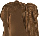
Dark Brown
(PMS 476C)
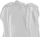
Russell Grey
(PMS 427C)
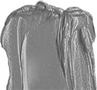
Dark Grey
(PMS 430C)
Cool Grey
(PMS 10C)
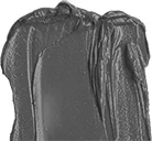
Dark Charcoal
(PMS 7540C)NEW
Black
White
Fluorescent Inks
Fluorescent Purple
Fluorescent Yellow
Fluorescent Blue
Fluorescent Green
Fluorescent Orange

Fluorescent Pink
Fluorescent Red
Premium - Glitter & Shimmer Inks
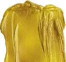
Gold
Glitter
Chrome
Glitter
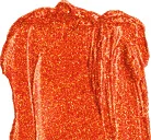
Orange Glitter
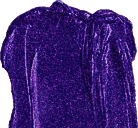
Purple
Glitter
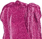
Fuchsia Glitter
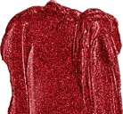
Red
Glitter
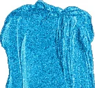
Blue
Glitter

Clear
Sparkle
Gold
Shimmer
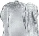
Silver
Shimmer
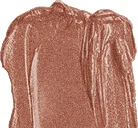
Bright
Copper
Premium - Specialty Inks
Liquid
Gold
Liquid
Silver
Glow in the
Dark
Reflective
Premium - Foil
Gold
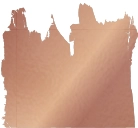
Rose Gold

Fuchsia
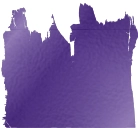
Purple
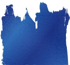
Blue
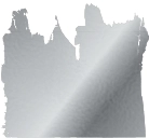
Silver
Watch How We Color Match to Original Artwork for Custom Apparel!
- Precision in Every Hue: Our color match inks ensure every shade from your original artwork is perfectly replicated, maintaining exact color consistency.
- Enhanced Color Accuracy with Technology: We use advanced cutting-edge technology to achieve finer color precision, ensuring a flawless match with your original artwork.
Need your color matched?
- If you don’t see an ink color that fits your needs, we can mix any PMS color for a small $25 fee.
- Our customer service team is ready to assist you today. Fill out this form to get started!
- Be sure to include as much information as possible so we can best assist you.